Products are selected by our editors, we may earn commission from links on this page.
Tattoos are meant to be forever, but what happens when “forever” comes with typos, bad designs, and hilarious missteps? From misspelled words and mismatched fonts to downright bizarre concepts, these tattoo fails will leave you laughing—and maybe rethinking your next ink. Prepare for a journey through permanent, unforgettable comedy!
Ur Forgettable?
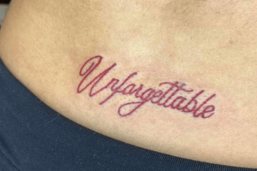
Ah, the beauty of permanent decisions! The tattoo reads “Urforgettable,” ironically unforgettable for all the wrong reasons. Was spellcheck unavailable that day, or was this a bold stylistic choice? Either way, it’s hilariously unforgettable.
Whether it was a typo, artistic flair, or sheer confusion, we’ll never know. What we do know is that this tattoo perfectly lives up to its name—though not exactly how they intended.
Now, imagine explaining this gem. “It’s a statement!” they’d declare, as friends struggle to stifle laughter. This proves that double-checking your tattoo design isn’t just important—it’s absolutely necessary for survival.
No One Can ‘Safe’ This Tattoo!
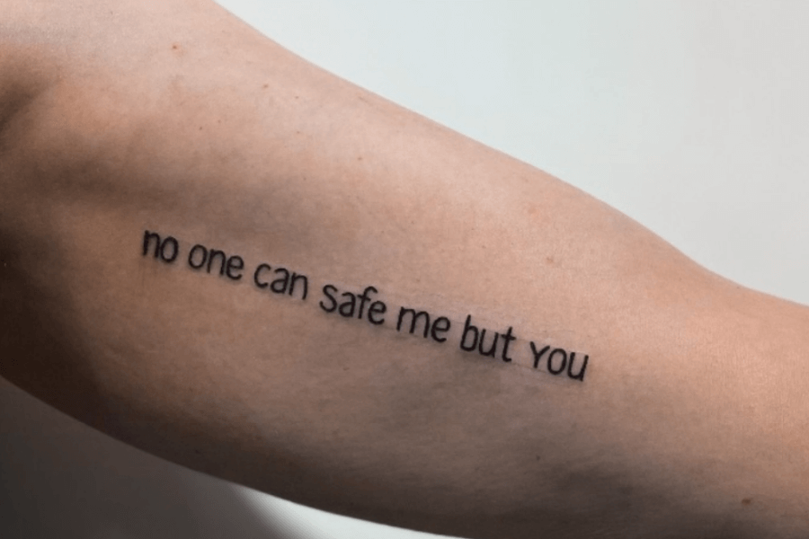
Oops, the irony of heartfelt tattoos and misplaced words! This tattoo confidently declares, “no one can safe me but you,” making us wonder if grammar was the one who truly needed saving here.
Was this a bold romantic statement or just a tragic misunderstanding of “save” versus “safe”? Either way, it’s permanently etched as a masterpiece of unintentional hilarity. Someone, please ‘safe’ this tattoo!
What happens if someone reads this aloud? Absolute comedy gold. The sentiment is deep, but the confusion runs deeper. A quick spellcheck could’ve saved the day, but now this hilarious blunder is eternal.
Thrtteen Reasons to Double-Check Your Ink!
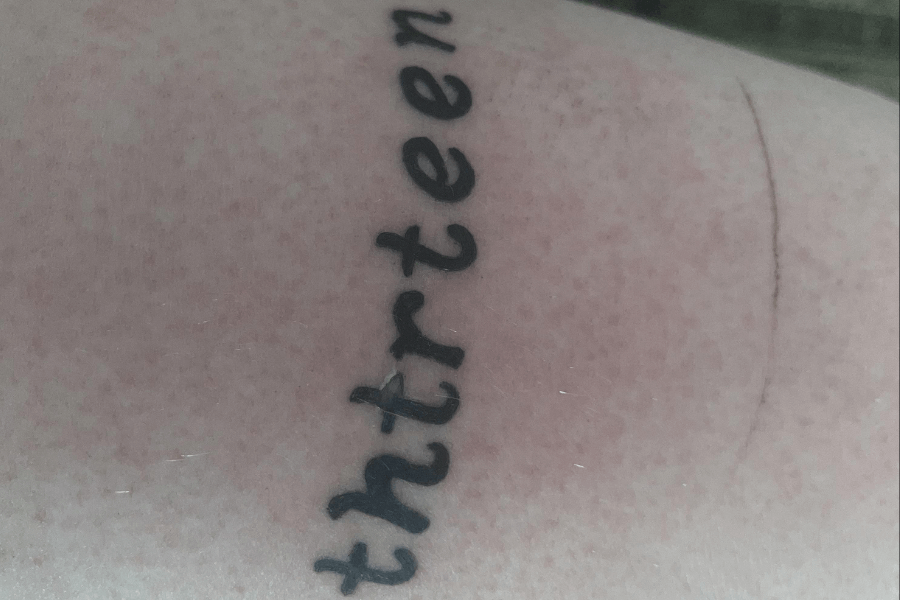
When you think of the number thirteen, you might picture superstition, bad luck, or rebellion. What you don’t expect is “thrtteen”—a spelling so creative it deserves its own dictionary entry. Truly unforgettable!
Was this a tribute to numerology, or did the tattoo artist skip spelling class? The missing “i” makes this masterpiece hilariously incomplete. It’s bold, baffling, and guaranteed to be a conversation starter!
If someone asks, “What does thrtteen mean?” the explanation is probably as entertaining as the tattoo itself. Lifelong decisions like tattoos prove that spelling matters! Always ask your tattoo artist to spellcheck!
Time Isn’t the Only Thing That’s Limited

Seriously, did nobody pause to proofread? “You’re” instead of “your” turns this from wise to wildly ironic. The message is meant to be profound, but the grammar fail completely steals the show.
It’s almost like the real lesson here is that every word matters, especially when it’s permanently inked on your skin. The internet is just a click away—find time to double-check your designs!
Even with proper punctuation, “You’re” and “Your” are not interchangeable. Sure, YOU ARE not “the time”, but YOUR time to research could’ve saved you from this permanent mistake. Yikes!
Fairytale to Nightmare
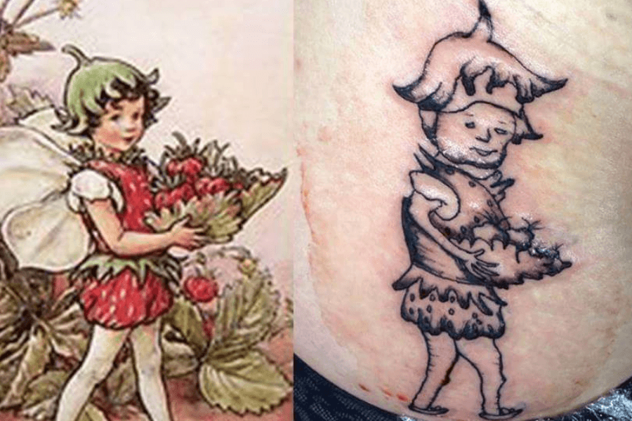
When artistic inspiration meets horrifying execution. The original image is a whimsical fairy holding strawberries, but the tattoo version looks more like her creepy cousin who’s just been through tough times.
From delicate fairy wings to what resembles droopy sleeves and a melting hat, this tattoo misses the mark entirely. The strawberry bouquet? It’s now an unrecognizable blob of confusion!
Do you think anyone will believe this is a fairy? It looks more like a haunted mascot. This is a perfect example of why choosing the right tattoo artist is just as important as the design.
Batman Called—He Wants His Dignity Back!
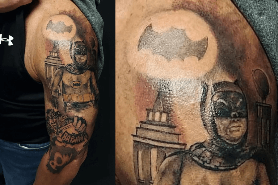
Oh, Batman, what happened? This tattoo was supposed to capture the Dark Knight in all his glory, but instead, it gives us the chubby-cheeked vigilante Gotham never asked for. Truly a plot twist!
From the awkwardly drawn mask to the “bat signal” that looks more like a cloud, this tattoo is a masterpiece of unintentional comedy. Even his arms scream, “Please, save us from this!”
Is this the Bruce Wayne we know of? Sure, if Batman skipped cardio and forgot his utility belt. It’s a hilarious reminder that not all tattoo artists are superheroes. Choose wisely, Gothamites!
Don’t Mind the Tattoo; It Doesn’t Matter!
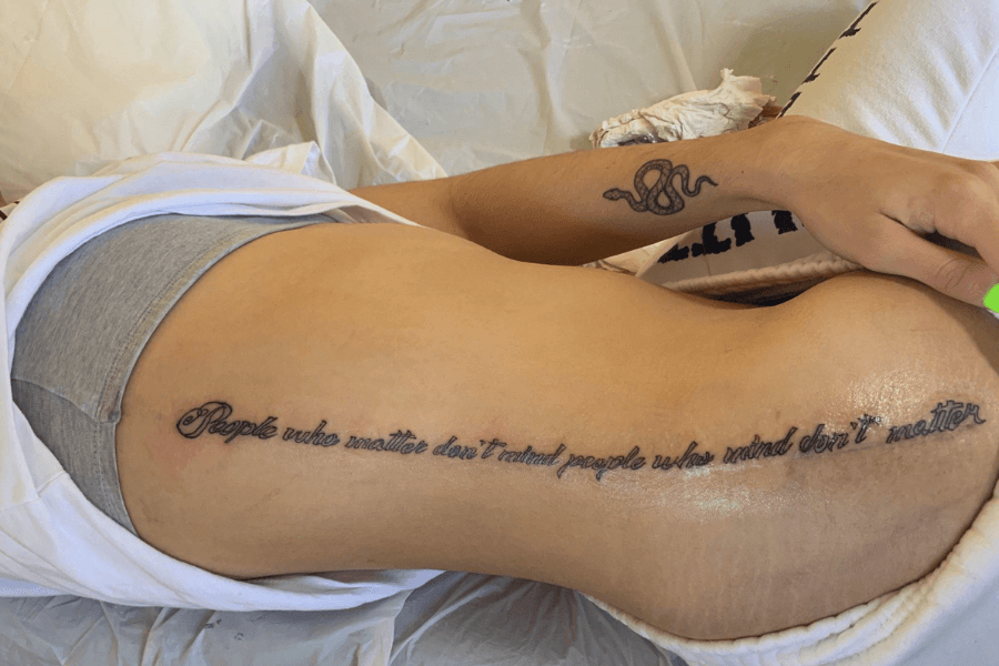
A Philosophical statement with a side of confusion. “People who matter don’t mind, and people who mind don’t matter” was the goal, but this version turned into a word salad of grammatical chaos.
The elegant script tries its best to distract you, but the jumbled phrasing and misplaced punctuation steal the spotlight. Instead of wisdom, this tattoo now looks like a riddle no one can solve.
Well, it’s supposed to be profound, but now it’s a life lesson in proofreading. Proof that even the best intentions can turn into hilarious permanent mistakes!
Lara Croft? Nope, That’s Lara Crap!

Oh, the ambition was there—an Angelina Jolie tattoo capturing her iconic Tomb Raider look. But what we got looks more like a cartoon character auditioning for an off-brand action movie!
The dramatic guns and intense gaze from the original photo are now overshadowed by a face that’s more doodle than diva. It’s as if someone whispered, “Make it abstract,” and the artist delivered hard.
Bold lines, zero resemblance—it’s hilariously unforgettable in the worst way. Now imagine the conversation: “Who’s that?” “Lara Croft!” Cue the awkward silence. “You mean Lara Crap?”
Sorry For My Poor ‘Judegmenent’

A bold “Judgement” tattoo sprawled across the lower back, yet the real judgment comes from spelling it wrong. Sometimes the sharpest tool in the room should be a dictionary.
The font is dramatic, the placement is eye-catching, but the missing “e” and extra letters have stolen the show. I wonder if the tattoo artist or the client skipped their grammar lessons entirely.
This tattoo screams confidence—just not in spelling! The ironic lack of “judgment” in the spelling is a permanent reminder to double-check everything before it’s too late.
Wings of Inspiration
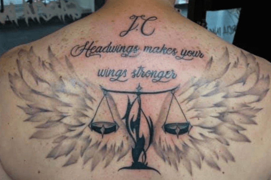
This tattoo is a masterpiece of ambition, complete with wings and scales of justice, but then there’s “Headwings.” It’s hard to tell if this is a typo or the birth of a new superpower.
Not gonna lie, the design demands respect, but the message leaves you scratching your head. Are “headwings” supposed to make you fly smarter? Stronger? Or just remind you that spellcheck always matters, even for ink?
It only proves that no matter how artistic your design, a tiny spelling error can send it soaring straight into the hall of tattoo fails. Oh, and before I forget—he probably meant “headwinds.”
Neglecting Spelling Since Angels Apparently Have Other Jobs

“May your neighbors respect you, trouble neglect you, angels protect you…” sounds poetic, but it seems even angels neglected their spellcheck duties on this one.
The elegant script adds charm, but the phrasing stumbles into confusion. “Neglect you, angels” sounds more like a plea for less divine attention. Drake definitely didn’t expect his words to take such a turn!
Do you ever talk to your guardian Angeles—I mean, angels? Maybe they could’ve guided better proofreading. Just a thought! Either way, Drake surely didn’t expect his lyrics to take such a funny turn.
When Heavy Metal Becomes Heavy on Regret
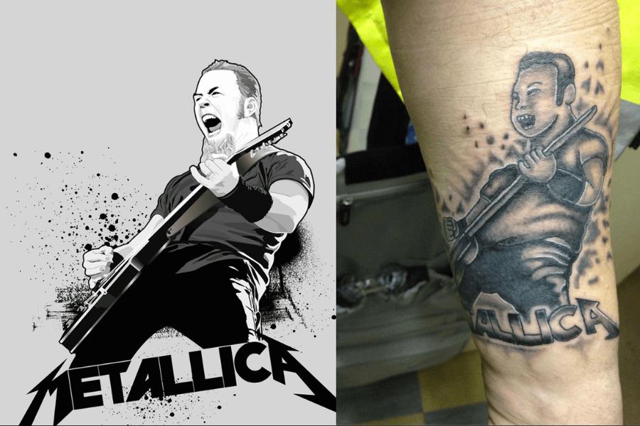
It had one job: to honor Metallica and its legendary frontman, James Hetfield. Instead, we get a cartoonish rendition that looks more like “James What-field,” who just picked up a guitar for the first time.
The exaggerated features, awkward proportions, and mysterious sparkles make it hilariously unrecognizable. The iconic Metallica logo almost saves it, but even that looks like it’s begging for a refund.
It’s less “Master of Puppets” and more “Master of Cartoon Missteps.” Some legends deserve better than a Saturday morning cartoon version of themselves. Let’s give them the tribute they truly deserve!
A Tattoo So Wrong It Needs a Prescription
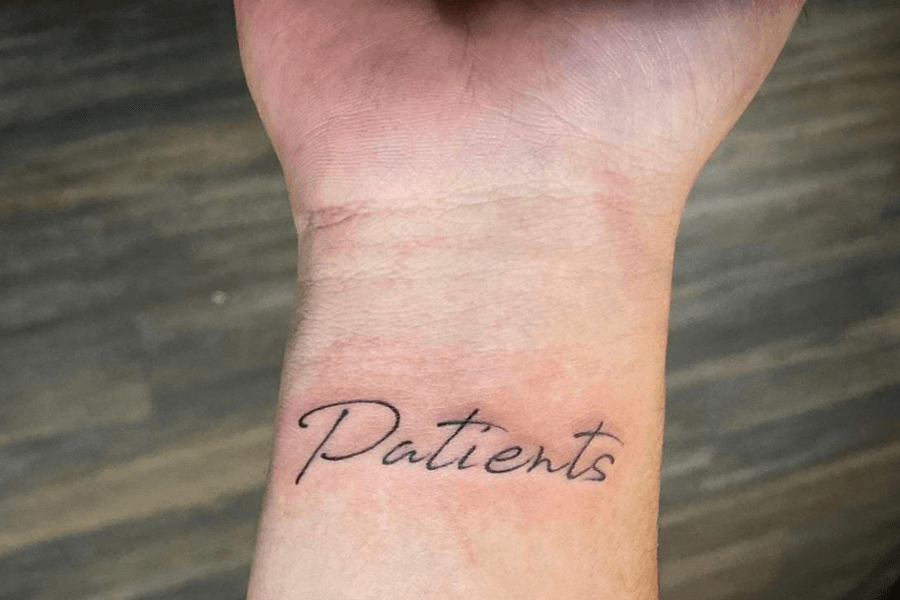
The wearer likely intended to ink “patience,” a timeless virtue. Instead, they’ve unintentionally declared themselves a medical professional. Paging Dr. Spelling Error, please! Your immediate attention is required!
The elegant handwriting might fool you at first glance, but the word choice stops you in your tracks. Instead of a peaceful mantra, it now hilariously suggests they’re running a busy clinic.
Imagine showing this off proudly, only to be asked, “Oh, are you in healthcare?” Awkward! This tattoo serves as a funny yet permanent reminder that even the smallest errors can lead to the biggest laughs.
Fairest of Them All? More Like Scariest of Them All!
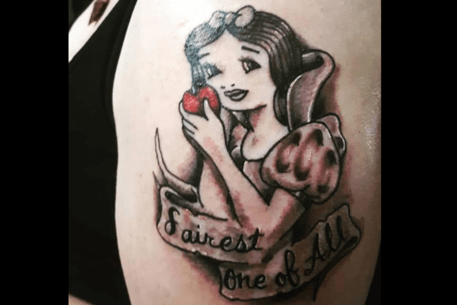
The classic apple is there, and the ribbon reads the iconic line, but poor Snow White looks like she’s seen better days! That awkward smile and haunting eyes! Shivers.
Her lopsided smile and vacant stare make this a Disney classic turned comedy gold. This tattoo aimed to immortalize the iconic Snow White, but somewhere along the way, it veered off into “Snow Fright.”
It’s like a budget cosplay captured forever in ink form. Well, it only serves as a reminder that even the fairest of them all needs a skilled artist to do them justice.
Anchored in Irony
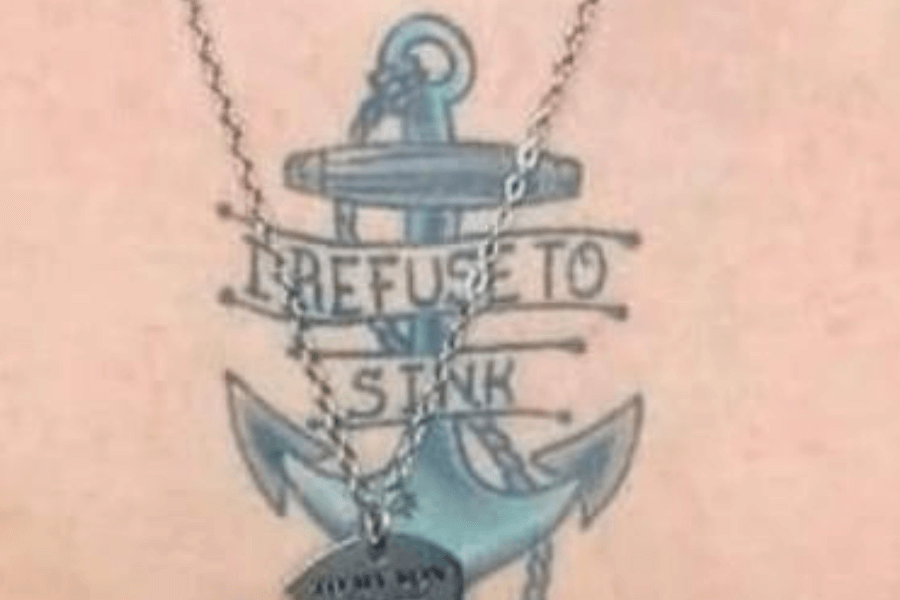
Look! It says, “I refuse to sink,” but features an anchor—the ultimate symbol of sinking! The irony is impossible to ignore, making it a comedic masterpiece of mixed messages and misplaced symbolism.
Anchors are literally designed to sink, yet this tattoo boldly contradicts their purpose. It’s as if the artist and wearer teamed up to defy both physics and common sense in one amusing stroke.
Even motivational quotes can go hilariously off-course when paired with the wrong imagery. Classic ink fail! Maybe next time, ask the tattoo artist to place the anchor in a floating device instead?
Spelling Errors? Never Lose Hoop!
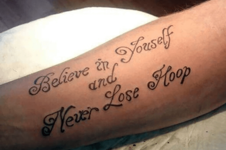
I can’t say for sure, but I might be losing “hoop” because of the spelling. Are you losing “hoop” too? Let’s talk about this together and have a good laugh!
Instead of a powerful life motto, it now feels like advice for basketball players or jewelry enthusiasts trying to keep track of their hoops. Either way, we’re “hoop-ful” this could eventually be fixed!
Picture “youself” asking the universe for signs as your confidence plummets, and then you randomly see this on the street It’s hilariously uplifting! Sometimes, all you need is a good laugh to keep going.
Love for Cliffhangers
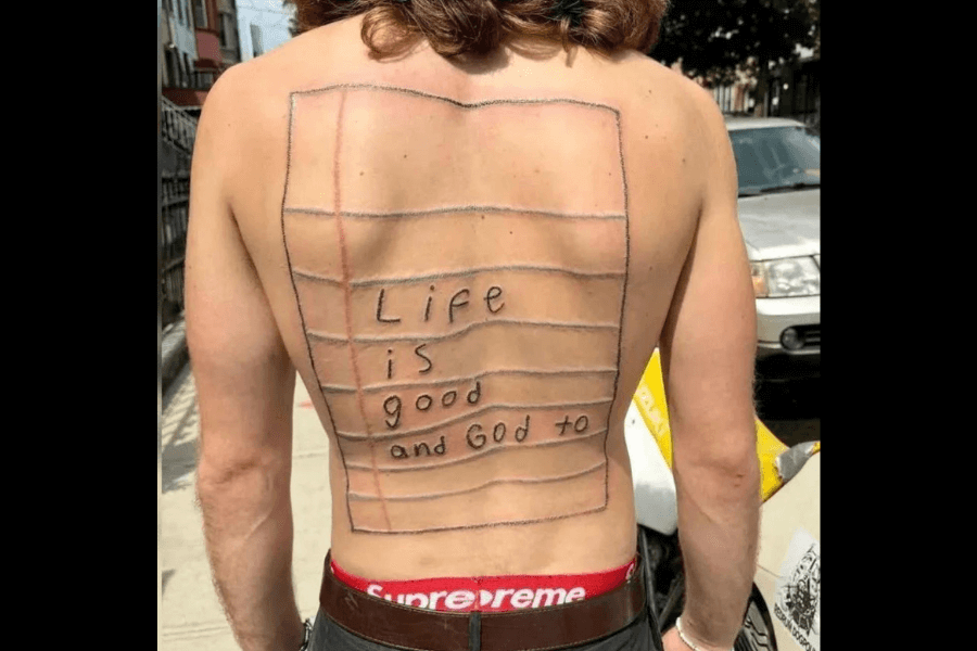
Life is good and God to…? Alright, buddy—what’s next? Don’t leave us hanging like that! Adding lined paper to your back doesn’t exactly help clarify the message either, just adds to the confusion.
The notebook design is bold, but the execution? Definitely questionable. It looks like someone took “wear your thoughts” way too literally. And the unfinished sentence? God to… what? Guess we’ll have to stay tuned!
I’m sure you meant, “Life is good and God, too.” Luckily, God is too forgiving to get mad at that error. Maybe He’d send your guardian angel to add an extra “o” for you!
Fear the Mighty Tiger… or Just Laugh
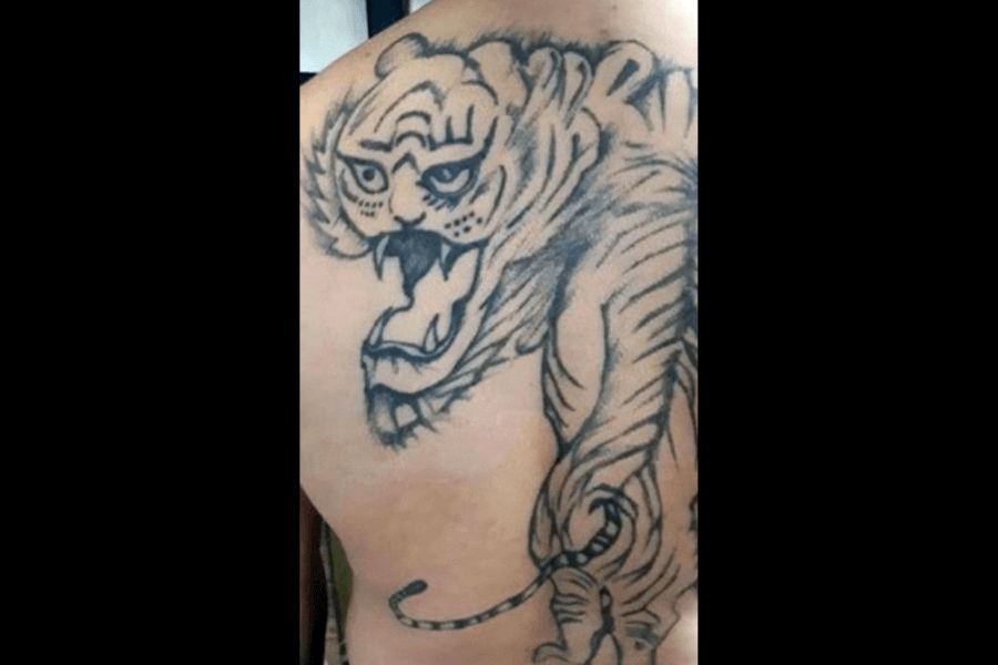
Do you hear the ferocious roar of a jungle king or the soft meow of a puzzled house cat? Looking at it, we’re left with what resembles a confused cartoon feline mid-yawn.
The face is unintentionally comedic, with uneven eyes and a jawline that whispers, “Why am I here?” rather than roaring, “Fear me.” It’s a tiger, sure, but one clearly having a rough day.
You can’t help but smile imagining someone proudly showing this off. It’s not just a tattoo; it’s a conversation starter and a reminder that even fierce predators need artistic precision to stay intimidating.
Fistful of Inspiration, Missing a Letter
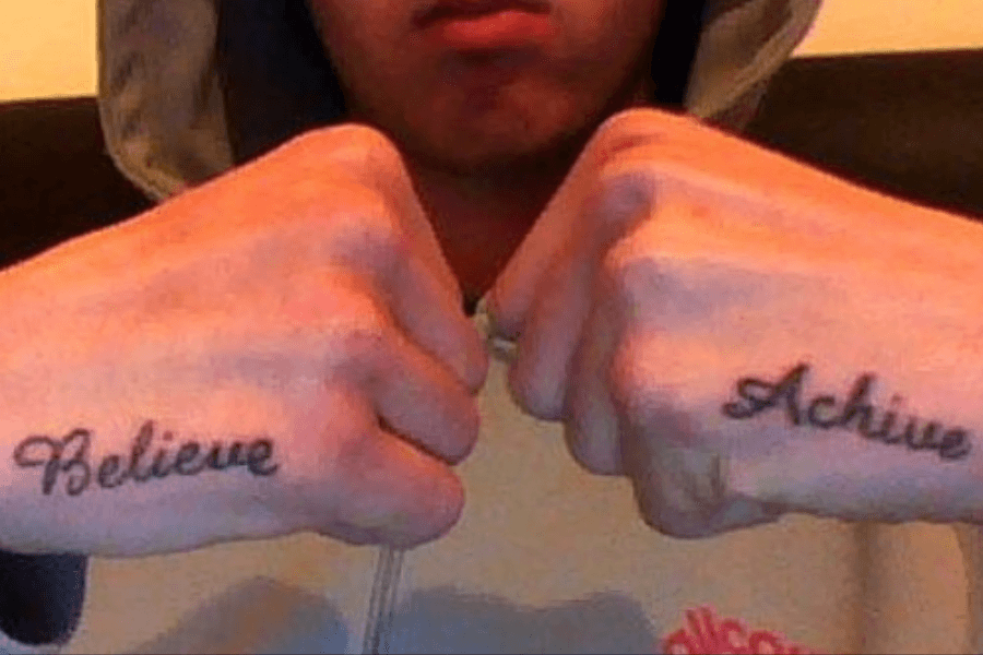
Okay, so check this out—this tattoo almost nailed it. One hand says “Believe,” super motivational, right? But the other hand says “Achive.” Yes, “Achive.” The irony? Totally achievable, even if the spelling isn’t.
The font says, “Take me seriously,” but the spelling says, “I winged it.” It’s like the tattoo artist thought, “Nobody’s gonna notice,” and the universe replied, “Oh, they’ll notice.” (And trust me, we noticed!)
Who knows? Maybe in 10 years, “achive” will make it into the Oxford Dictionary as a variation of “achieve.” Until then, we’ll just have to wait… and chuckle in the meantime.
A Tattoo That Made a Big Dicision
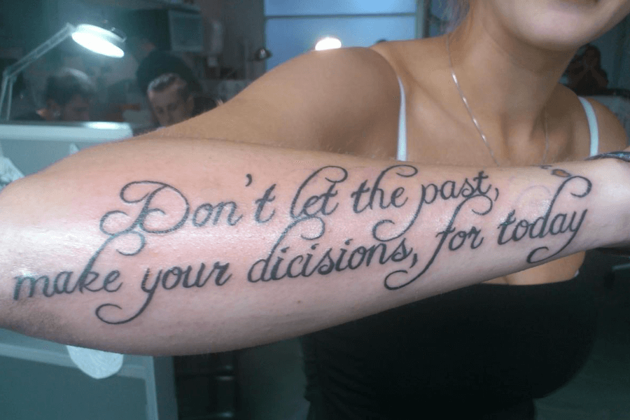
The message here is clear: “Don’t let the past make your decisions for today.” But unfortunately, the past clearly had a hand in spelling “decisions” as “dicisions.”
Another case of typo stealing the spotlight! It’s like the tattoo artist got so caught up in the dramatic flourishes that they completely forgot about spellcheck. (How many times do we need to remind you?)
Would you give this tattoo a passing grade or not? Would you leave the spelling as it is, or would you ask your tattoo artist to fix it? “Dicisions,” anyone?
Eyes Don’t Lie
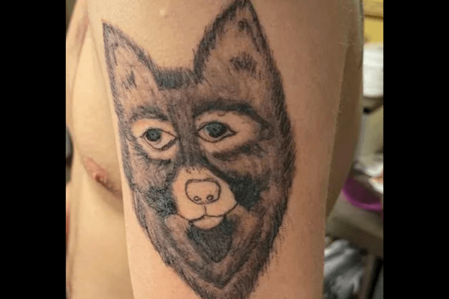
I think this is more of a bewildered house pet than a fierce predator. With those human-like eyes, this wolf seems to be questioning its own existence. (He looks so sad, too!)
The details are… unique, to say the least. The green eyes are intense, but not in a good way, and the awkwardly placed snout makes this wolf look like it’s caught in a bad selfie.
If your spirit animal is a wolf, would this really be the one you resonate with? It looks like it spends its days pondering its life choices rather than prowling the wilderness.
Holy Words, Unholy Spelling
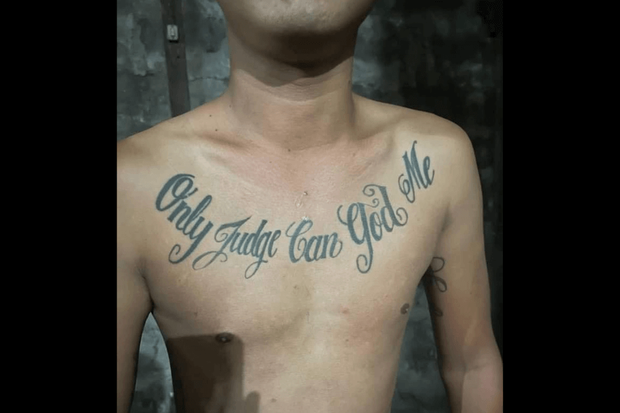
Okay, first of all… what’s going on here? Who’s judging whom? Is the judge God, or is it God the judge? We’re all confused! Can someone please send help?
Somewhere, a tattoo artist is dodging calls from their high school English teacher, while God shakes His head, saying, “Don’t drag me into this.” Divine comedy, indeed.
This misspelled masterpiece is a reminder that, while God might not judge, the internet certainly will. Moral of the story? Proofread your prayers… or risk becoming the patron saint of tattoo fails.
Jon Bovi’s greatest hit: ‘It’s is My Life
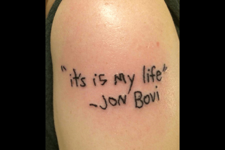
Let’s dive into this lyrical masterpiece, shall we? “It’s is my life” – a bold declaration of individuality, brought to us by the esteemed Jon Bovi. Wait, what? Who’s Jon Bovi?
Not only did Bon Jovi get rebranded, but “It’s is” also graced us with its unnecessary repetition. It’s as if the tattoo artist wanted to make sure we really knew it’s their life – twice.
Somewhere, the real Jon Bon Jovi is laughing while silently screaming into his platinum records. Always double-check your quote and source, folks, or at least ask your tattoo artist to do it for you.
Irony Has Entered the Chat

Well, no “regrets”… except maybe this one. Nothing says “no regrets” quite like a regretful tattoo. It’s a powerful mantra—until you forget to spell-check and end up living without “regrets,” but definitely with some.
The irony here is almost poetic, screaming louder than the tattoo gun. It’s like the universe decided, “You said no regrets? Challenge accepted.” The result? Nothing but a misspelled badge of regret!
This isn’t just a tattoo fail; it’s a life metaphor. Sometimes, the things meant to inspire us trip over themselves and fall flat… all because of one missing letter.
Mama’s Love Is Eternal, but This Tattoo Shouldn’t Be
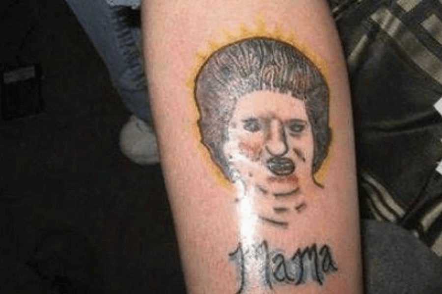
Some tattoos honor loved ones with stunning detail; others… well, they go for the abstract. I hope his mom forgave him, really. It’s unforgettable—just not for the right reasons.
This tribute to “Mama” is less “cherished family matriarch” and more “a Picasso painting having a bad day.” The facial proportions are wild, the shading feels unfinished, and what’s going on with the neck?
The comedy here is in the details, or lack thereof. It’s as if the tattoo artist was playing a game of “Guess Who?” with no hints. Mama deserves better… much better!
Motivation Brought to You by a Double Negative
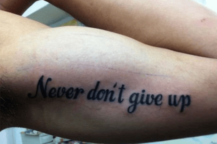
Motivational tattoos are supposed to inspire, right? But this one, “Never don’t give up,” leaves us scratching our heads. Are we supposed to give up? Not give up?
Someone wanted a simple mantra to push through life’s challenges, but instead, they ended up with an ultimate double-negative puzzle workout for your brain.
It’s not just motivational; it’s educational—perfect for your English teacher’s “What Not to Do” lesson. Always double-check the message before it becomes permanent! Never don’t hire a tattoo artist who understands grammar.
Because Committing to a Wig Was Too Much Effort
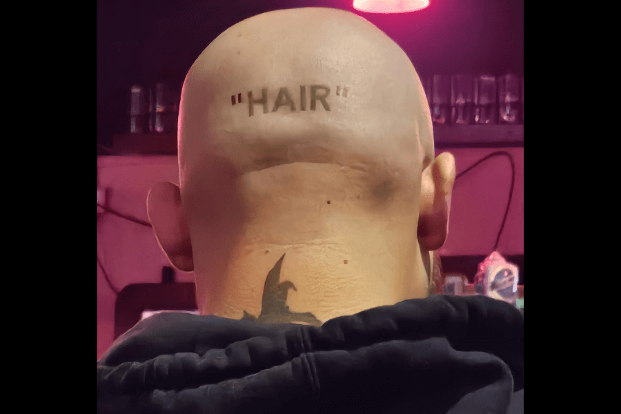
Some tattoos are ironic, others are sarcastic, and then there’s this gem: “HAIR.” Quotation marks included for extra comedic effect. It’s shiny, and it’s the perfect punchline for anyone embracing baldness with swagger.
What makes this hilarious? We’re not only pointing at the irony here but also the audacity! Imagine sitting in the tattoo chair and telling the artist, “I want hair—but, like, ironically.”
The tattoo artist deserves credit for keeping a straight face while delivering this masterpiece. A bald head with “HAIR” inked on it is the ultimate mic drop for anyone losing their locks.
When Love Conquers All—Except Proper Word Usage
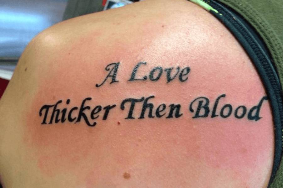
Ah, love—so powerful, so eternal, so thicker then blood. Wait, what? It seems another tattoo artist skipped grammar class again! Why, oh why? Is it that so hard?
We get it—they wanted to immortalize an unbreakable bond, but instead, they immortalized a common language fail. “Then” and “than” aren’t interchangeable—just ask anyone armed with a red pen!
Moral of the story? Love might be thick, but grammar rules are thicker. Take your classes seriously, especially if you plan to write something permanent on your body!
Your Tattoo Deserves a Red Pen Intervention
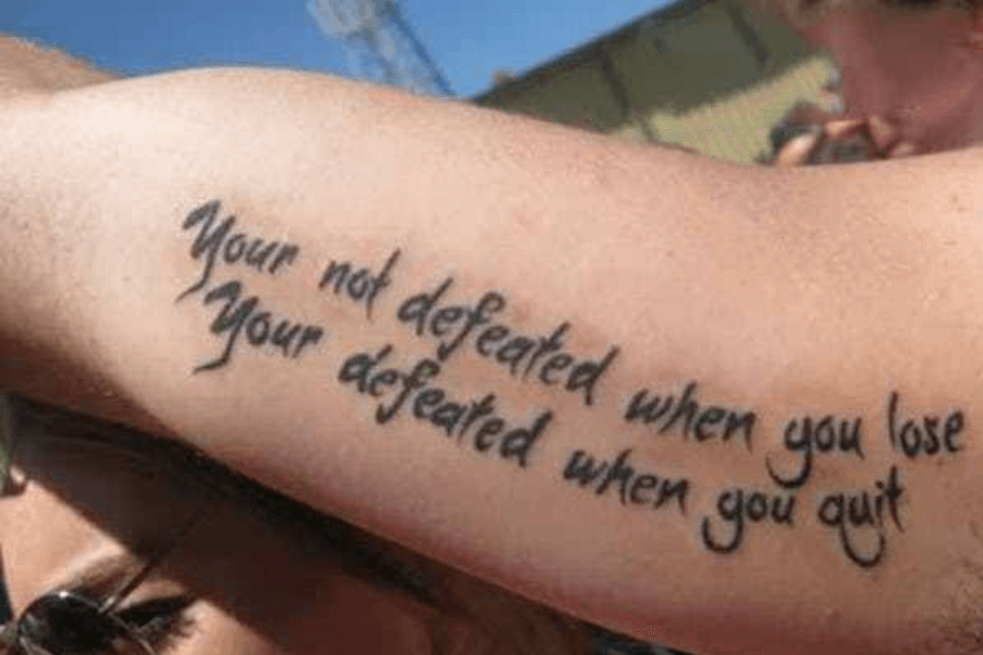
Here we go again! I am defeated; I am quitting. (Kidding, I’ll still write about it.) Somewhere, an English teacher is sobbing, and I wish I could wipe their tears.
“Your not defeated”? Oh, the irony of being defeated by the English language itself. Double the “Your,” double the cringe! This is chaos. I’m shaking my head and clicking my tongue as we speak.
Inspirational words hit harder when they’re spelled correctly. So, please… proofread before committing, or you’re—sorry, your—defeated by your own ink.
It Takes Real Strenth To Overlook This Typo
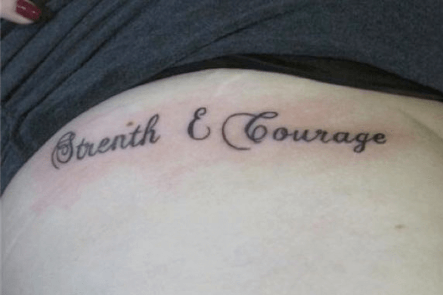
Take a look at this. “Strenth & Courage” boldly omits a letter, proving that spelling might require a little strength and courage of its own.
The funniest part? The tattoo is supposed to represent resilience, but somewhere, a “g” is out there feeling neglected, and I’m losing my own strenth just by looking at it.
If you’re aiming for inspiration, double-check the spelling—or risk becoming an internet sensation for all the wrong reasons! It’s not that hard, honestly. Software can help you—use it!
This to Shall Pass…
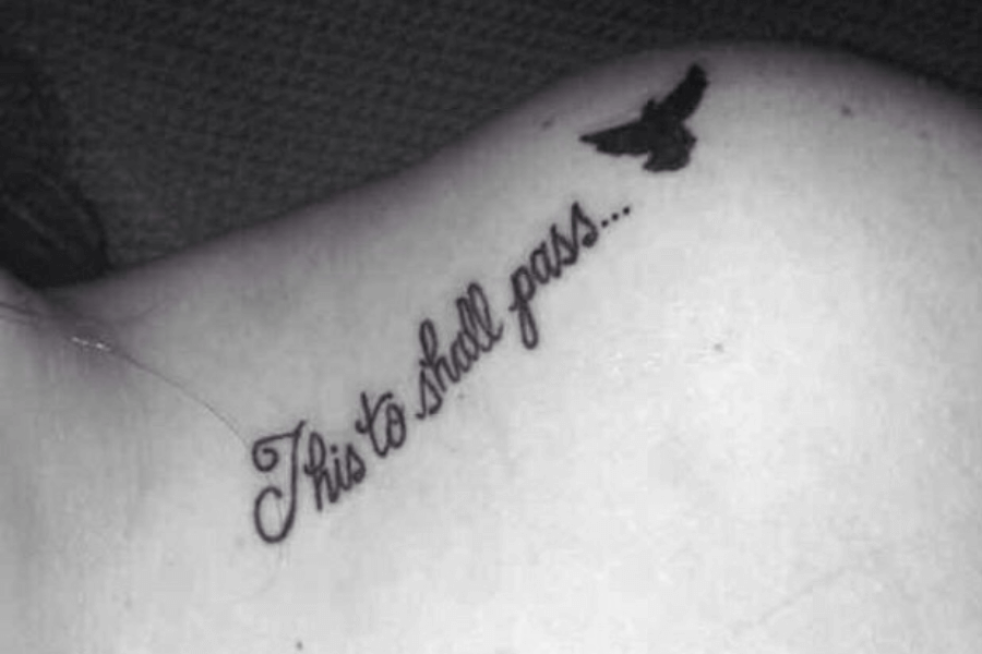
No, this goes straight into the grammar hall of fame! When “too” becomes “to,” you know the tattoo isn’t inspiring anymore—it’s a tragic tale of misplaced grammar that refuses to pass.
A phrase meant to provide comfort has accidentally provided English teachers with nightmares. The missing “o” makes all the difference, doesn’t it? The typo completely overshadows the intended meaning.
Reddit user u/bossopotomus shared that this was her friend’s tattoo, but they don’t have the guts to tell her it’s wrong. Well, posting on Reddit isn’t much better. Just say it already!
Fierce, Brilliant, and… Stong?
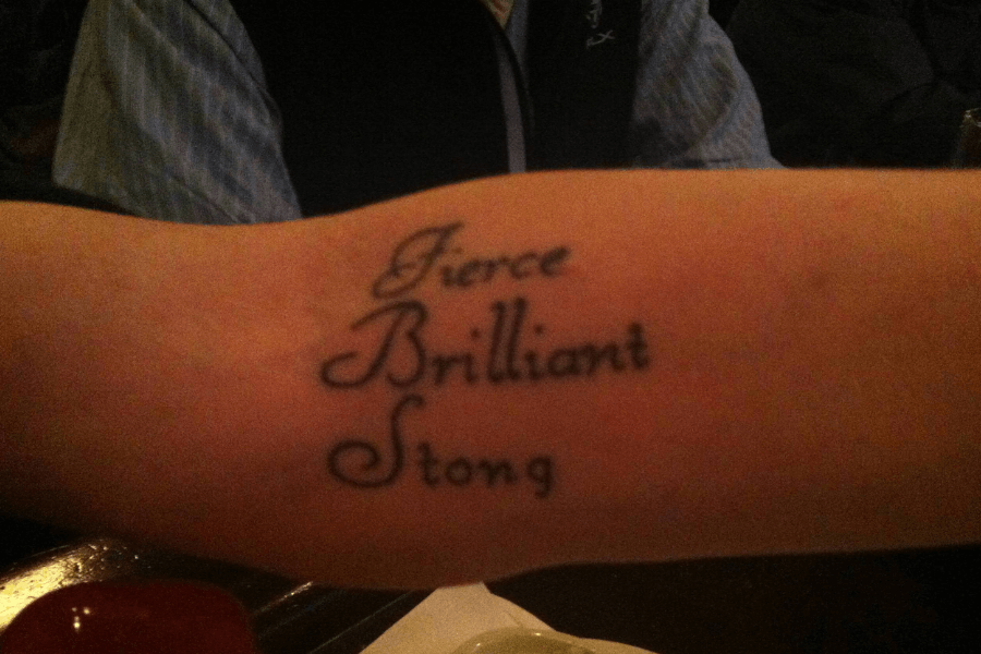
A classic declaration of being “stong,” leaving “strong” somewhere offstage, probably rolling its eyes. A single missing letter turned a motivational mantra into baby talk! (Kids do struggle with pronouncing /r/, after all.)
Imagine walking into the tattoo shop, ready to ink your personal mantra of strength and brilliance, only to leave with a typo that’s just as loud as the message itself. Talk about a plot twist!
Well, all it takes is confidence, and you can definitely shine through—even when spelling doesn’t. After all, what’s truly fierce? Owning your flaws—stongly, of course!
Acute Tribute to Mom
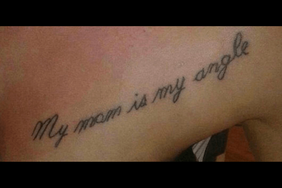
“Mom is my angle”—because angels are overrated, apparently! Some tattoos are meant to honor loved ones, and this one tried—really, it did. It could’ve been a sweet tribute.
That simple typo completely changes the meaning. Instead of an angelic figure watching over them, Mom is now a proud triangle—or perhaps a protractor in disguise. It’s hard not to laugh.
Nonetheless, the sentiment is touching. Love your mom, honor her memory, but always double-check—unless you really meant to say she’s 90 degrees of perfection!
Somebody To Love… or To Fix This Tattoo
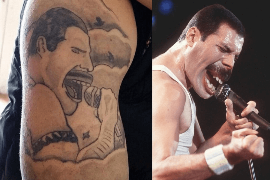
We will, we will… wonder what happened here. This tattoo wants to break free—from itself. The exaggerated features—those lips, that arm—turn a rock legend into something straight out of a cartoon.
Yes, it’s Freddie Mercury, but reimagined by someone who’s under pressure to draw fast. His microphone looks like it’s fighting for survival, making this less “Bohemian Rhapsody” and more “Bohemian Tragedy.”
If you’re honoring a legend, make sure the artist’s portfolio is solid. Otherwise, you’ll end up asking, “Is this the real life? Or just bad ink-tasy?”
In Case of Emergency, Hand Wash Only!

We’ve all seen washing instructions on clothes, but have you ever seen them tattooed on someone’s neck? This guy went full “care label chic,” ensuring the world knows how to handle him—literally.
What are the odds of seeing this masterpiece tattooed on someone’s skin? “Hand wash warm water, mild soap, line dry”—it’s as if his skin is a delicate sweater.
Some people wear their hearts on their sleeve; he wears washing instructions on his neck. Is it a statement on being high-maintenance? A joke taken too far? Either way, it entertained us!
The Lion King: Budget Edition

This is the circle of life but drawn without a compass! Well, it seems like Simba’s journey to becoming king was derailed by bad hands and bad ink.
Mufasa looks like he just remembered he left the stove on, and Simba’s face screams pure disbelief. It’s as if both are silently regretting this tribute alongside the owner.
All I can say is Mufasa deserved better, and so did this person’s back. Can you feel the cringe tonight? Hakuna Matata, but maybe rethink that ink!
Your Life Is As Good as Your Mindset… and Your Spell-Check
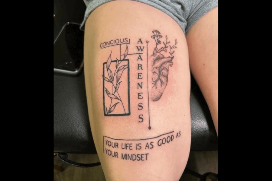
Conscious spelling? Not so much. It would have been profound… if it had been spelled correctly. Instead, the missing “s” turned it into a case of ironic self-awareness.
A tattoo meant to promote mindfulness and reflection somehow skipped the most basic form of attention: spell-checking. It’s crucial, especially when you’re about to get inked for life!
The art is there, it’s deep, but the spelling is shallow. Reminder: before committing to your deep, motivational phrase, double-check it—because “awareness” starts with paying attention to the small stuff, like spelling.
Hardly Quinn
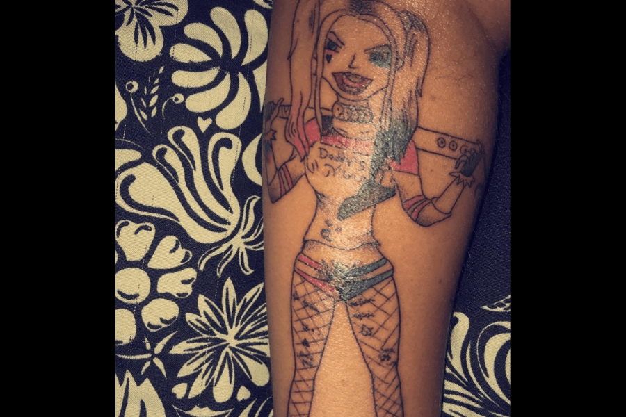
Harley Quinn, as envisioned by someone who’s never seen her! This tattoo takes the madness to a whole new level. The resemblance? Let’s just say it’s abstract.
Harley’s infamous charm is replaced with a slightly terrifying grin and legs that look like they’re wearing fishnets made by an amateur spider. It’s chaos, but not the good kind.
Is this “Harley Quinn: The Parody Edition”? Look, even the baseball bat looks like it’s ready to surrender! This is what happens when your ink is as unpredictable as Harley herself.
A Lamp or a Mushroom? Art Is Subjective
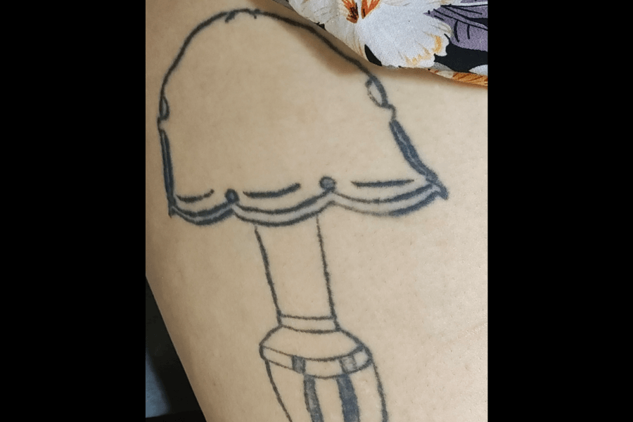
Tattoos tell stories, but this one speaks of regret. It looks like a lamp—kind of—but the real issue is the backstory: she was pressured into getting it by her ex.
The design itself is awkward and laughable, but the real issue lies in what it represents—a time when she felt she had no control. The uneven lines and strange proportions reflect her discomfort.
Tattoos should be personal and empowering, never a reminder of someone else’s influence. Thankfully, she’s left both the ex and the awkward lamp, proving it’s never too late to reclaim your story.
It’s a Beautiful Day To Save Life’s
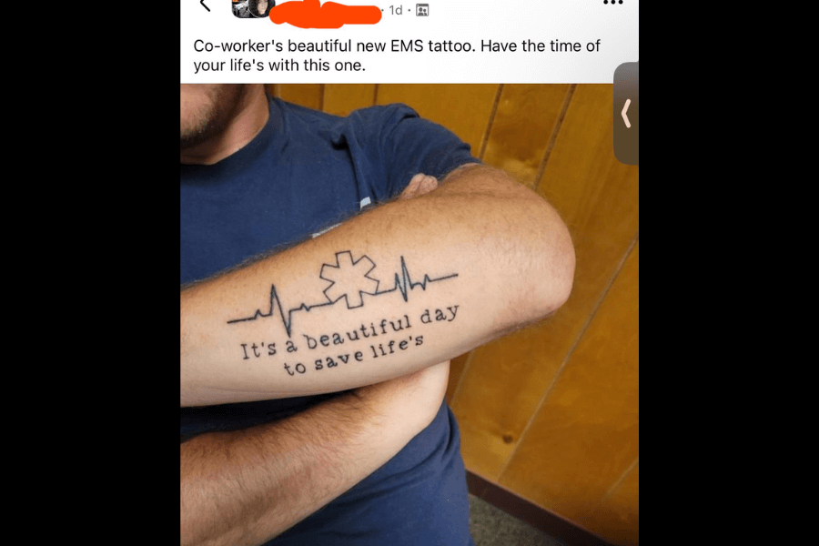
To save life’s what? The suspense is killing us! Beautiful sentiment, catastrophic punctuation. A tattoo honoring life-saving work has unintentionally put grammar on life support.
Apostrophes aren’t meant for plural words, but this one slipped through—and stayed forever. This is every grammarian’s nightmare! How hard could it possibly be?
Tattoos deserve as much care as an emergency room patient. Let me say this one more time: proofread before you ink! It only proves that saving lives is easier than saving grammar from punctuation chaos.
“It’s So Bad, I Kinda Like It!”
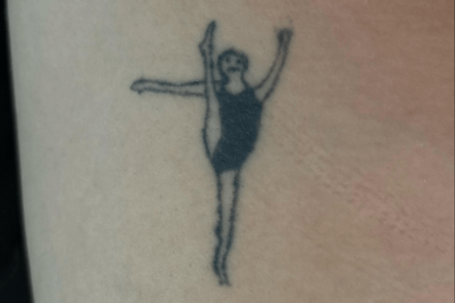
You might disagree, but Reddit user u/xombae thinks this is her favorite. She sees beauty and grace. She wants to know her. She wants to be her. She’s the tiny dancer in all of us!
She’s not even kidding when she said she wants to copy this tattoo from Reddit user u/Ornery-Bathroom4729, with their permission and the artist’s. It brought her so much joy!
This is why art is subjective. What might seem ugly to you might mean something entirely different to someone else! The “dancer” has energy, and that little face makes it even better!
Galloping Straight Into a Tattoo Fail
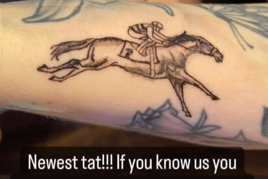
And they’re off! To the tattoo cover-up clinic, that is. This is when your horse has two speeds: stop and artistic confusion. Would you get this tattoo?
The horse’s legs look like they’re auditioning for a surrealist art piece, and the jockey appears just as confused as the rest of us. Is it running or floating?
Maybe double-check your artist’s grasp on equine proportions before heading to the inking chair! Good intentions don’t always result in good ink. Keep that in mind.
Stay Calm, but Also… What Does P4N1S Mean?
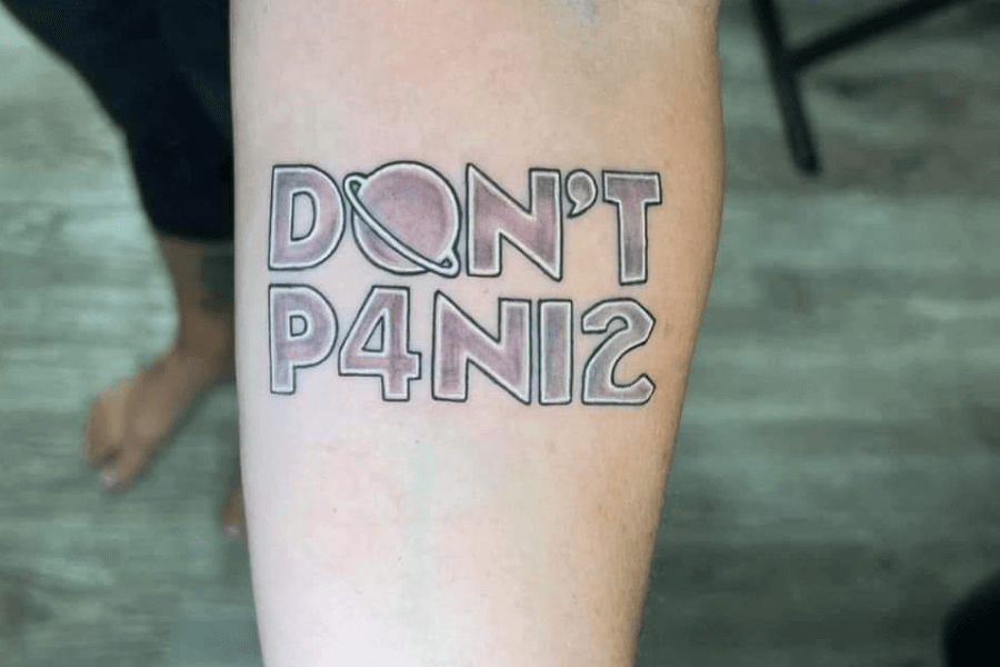
Or is it PANI-TWO? We’re all a little confused by the design, though the tattoo itself looks great! “Don’t P4N1C” is supposed to be reassuring, but the leetspeak twist makes it hilariously cryptic.
Instead of delivering a clear reminder to stay calm, it looks more like a Wi-Fi password or a secret alien code. The clever concept seems to have gotten lost somewhere between design and execution.
He really should’ve asked for a second opinion. Paying homage to The Hitchhiker’s Guide to the Galaxy is awesome, but next time, a bit of clarity might help avoid the “P4N1C.”
A Minimalist Tattoo Trend?
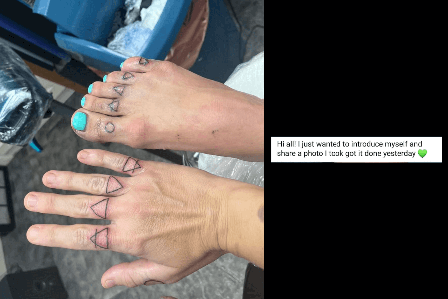
Proof that tattoos really do go hand in hand—or foot to foot. An attempt at understanding the five elements of the universe gone wrong, it ends up looking more like a cheap sketch!
While triangles and circles have deep symbolism for some, on toes and fingers, they resemble doodles from a bored math student’s notebook. It’s quirky, but definitely unexpected.
I wouldn’t pay for something like this—would you? Whether it’s an inside joke or a spontaneous decision, it’s hard to ignore (or forget) this truly unique design!
Everything Happens for a Font Change
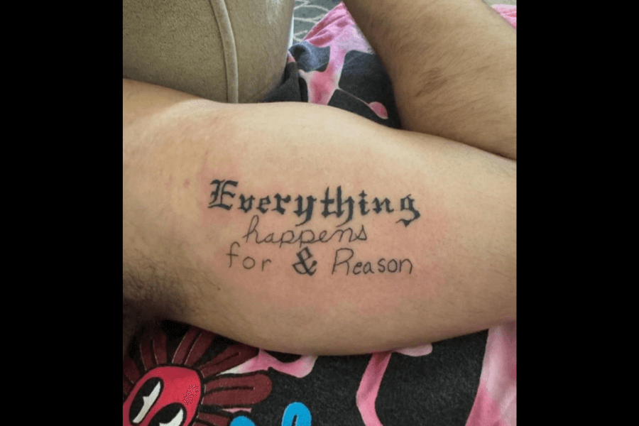
Yes, everything happens, including this chaotic font combo. “Everything happens for & Reason” combines mismatched fonts and a random ampersand, turning a heartfelt message into a messy design.
The gothic “Everything” clashes with the handwritten “happens,” and then comes the star of the show—the giant, out-of-place ampersand. Did the tattoo artist get bored halfway through?
If “everything happens for a reason,” the reason here is clearly a lack of proofreading and font consistency. A little planning could’ve gone a long way!


